
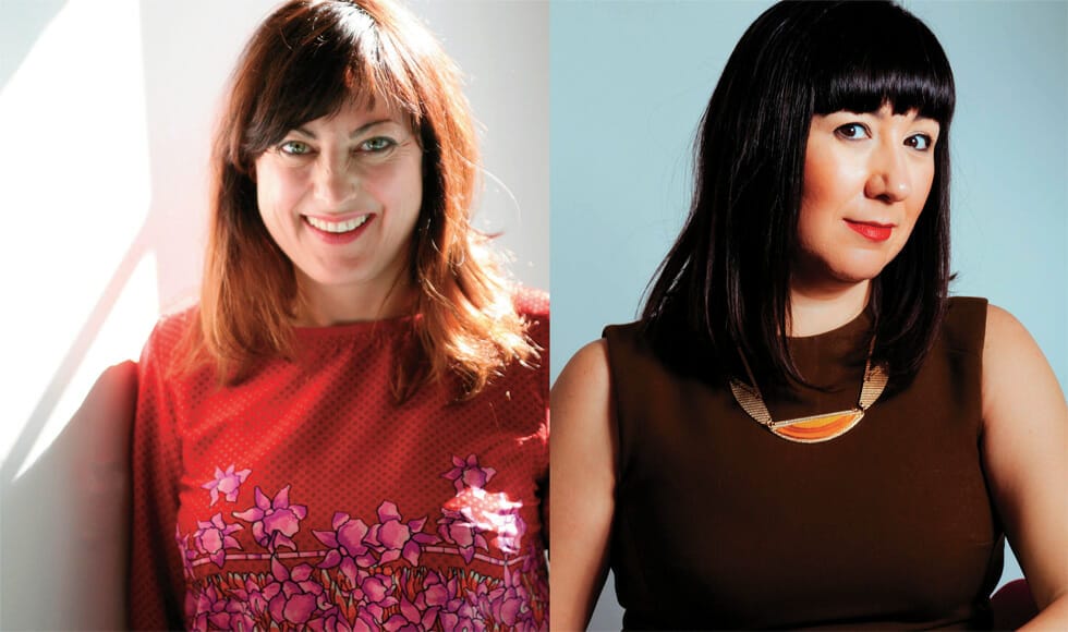
The tsumani generated by the pandemic imposes a change, between physical and digital, also in the relationship with colours and with their meaning: Justine Fox and Carolina Calzada-Oliveira, founders of Calzada Fox talk about this topic
Talking about colours, in this new era, unfortunately started and dramatically influenced by the pandemic, is almost “strange”. As if it was not enough “important”, if you take an even too superficial look, as a discussion topic. It’s not like this. Starting up again from colours is, absolutely, a need. And the contents of this interview demonstrate it. They are by Justine Foxand Carolina Calzada-Oliveira, founders of the Calzada Fox colour consulting hub.
Starting up again from colour
What does it mean to talk about colour today, that we are not yet living in a post Covid era?
Colour is absolutely relevant to the conversation today, especially when we’re talking about lifestyle, brand and products. Research has shown that our collective colour preferences are impacted by major events in society and our response is either to reflect or counter what is happening around us. It is part of the way that we make sense of what is happening and connect with each other through this unspoken language.
What COVID has highlighted are many of the problems that were inherent within our existing systems, both socially and in our business practices, not least the lack of agility and disconnect to a phygital world. This shift means that it is crucial for colour to translate across digital and physical platforms.
How much can colour be a psychological tool for rebirth, not only regarding the fashion system?
After a crisis in the past, we have experienced periods where colour becomes more pared back, simplified and neutral, then as recovery begins colour in general becomes more vibrant and saturated. This has to do with collective confidence: where there is time for reflection and incubation, innovation follows. However, as technology has advanced, the possibilities of digital expression have allowed more verdant hues and effects come through much earlier, which is incredibly exciting to see and psychologically clarifies the ways forward.
Colour as a tool
How can color influence the choice when buying a dress, a shoe, a bag etc?
Many of you will already be aware that 87.4% say that the deciding factor in a purchase decision is based on colour. This is interesting in itself, however, more important is to remember that we rarely see colours in isolation and when we’re presenting products, the colour combinations we create both within the collections themselves and in the retail environment, either digital or physical, are crucial to that final choice to buy.
This presents us with a fantastic opportunity to create harmonious palettes within our visual merchandising, that not only showcases the product, but taps into the emotion of your customer.
The latest digital fashion shows have shown, in particular for men and for leather, a renewed presence of black, as seen in Celine: why does black always come back and never disappear from collections, and the greatest volumes of production are made in this color?
Black is eponymous in fashion like technology, for many psychological and symbolic reasons. If we understand that black is a near total absorption of light, this creates a visual barrier that plays on the sense of fear and intrigue in our minds. This makes it an incredibly powerful colour, exuding the gravitas and glamour that many of us aspire to project, especially when we feel uncertain.
Black is regularly seen to be the largest volume sales within these industries for its perceived longevity, anti-trend persona and universal compatibility with all other colours.
As a specialist colour agency, we understand that this is not the case. Black is infinitely nuanced and like all other colours creates the most successful relationships in specific harmonized combinations.
Colour as identity
Is it right, in your opinion, that colour becomes a trademark, as in the case of Louboutin’s red sole?
Colour is the first attribute that is subconsciously recognized when we see a brand logo. This happens within hundredths of a millisecond before shape or wording comes into focus.
This makes colour an incredibly valuable communication asset for a company. Think of your own example, Louboutin, instantly you associate the brand with that flame nail polish red in your mind. You see that flash of colour on the street, you know what brand is.
You now have your product advertised clearly every time one of your customers wears it. We can see that from some of the cases that have been brought to court with the aim of copyrighting a colour, how important and fiercely contested a subject it is.
If a brand has designed its own unique colour with a specialist that specifically represents its own values, then it is right that it can be protected as any other asset. Where this is selected from a colour standard like Pantone or RAL, copyright cases tend to fail.
According to Pantone, colours for 2021 will be two: a gray (PANTONE 17-5104) and a yellow (PANTONE 13-0647). Moreover, there will be two colors identified by Lineapelle for the spring-summer 2022 season: green and blue. How do you rate these choices, and what are your preferences?
Colour of the Year is a marketing narrative that is interesting from a debate perspective, reflecting the zeitgeist, but as you see many companies and industries announce different colours in response to the trend driver stimulus.
We have seen a general global trend towards warmer colours in the yellow-red area within the interiors industry for Colour of the Year 2021, however in fashion this appears further towards blue-green colour space, which we see the interiors sector picking up more on in 2022.
As experts in colour development, these are broad observations, however we focus on who the brand is and what their specific aims are in their visual identity or product.